The Impact
Angelic Skies now shares a distinct, unified visual identity—its social feed, website, and print materials feel coherent, enchanting, and unmistakably theirs.
The cohesive brand system positions Angelic Skies above competitors lacking visual strategy. A refined identity signals credibility and quality, helping attract ideal clients seeking an elevated, emotional photography experience.
The identity system is flexible enough to evolve while maintaining the core brand essence. The brand is future-ready; capable of enduring expansion, narrative shifts, and new products/services.
Angelic Skies Branding
Angelic Skies is a photography business based out of Georgetown, South Carolina. They strive for excellence in preserving life's beautiful moments. Their mission being to collect memories with a creative flair, passion and a touch of magic.
Service
Year
2024
Company
Angelic Skies Photography
Industry
The Challenge
Obel Studio was tasked with creating a cohesive brand identity for Angelic Skies Photography. The system needed to align with the core values of the business: warm and inviting, passionate, and artistic. This visual identity was required to be consistent across all platforms (digital and print). In addition this, we were tasked to build this system to withstand the test of time, and remain scalable as the company grows.
The Solution
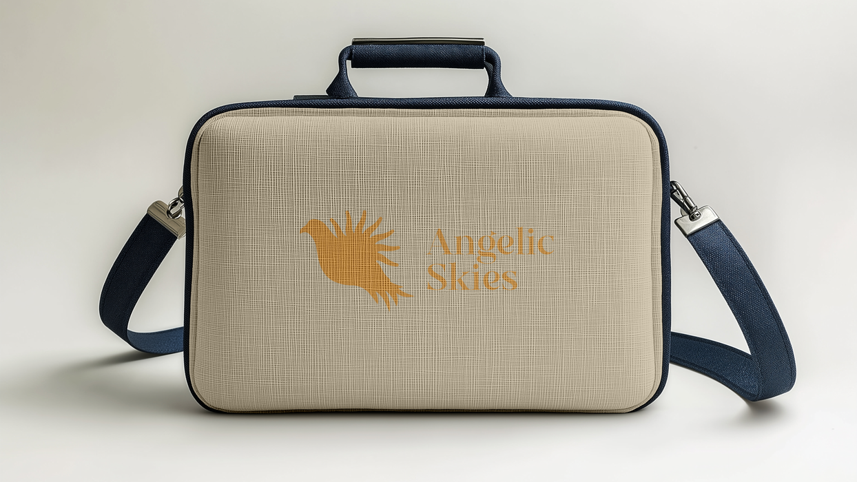
The logo suite consists of a primary logo— a dove icon with a stylized sun wing, symbolizing growth and new beginnings, and a secondary logo for small spaces. This logo suite came packaged with a color system of Sunlight Gold- bringing warmth, Sky Blue- bringing calmness and serenity, and a cream for neutrality. In addition these colors were chosen to elevate the captivating logomark.
The Approach
Angelic Skies mission is to "capture lives beautiful moments with creative flair and a touch of magic". Their core values being friendliness and approachability, align directly with their target audience being college students (18-24 year olds) with a need for photography.
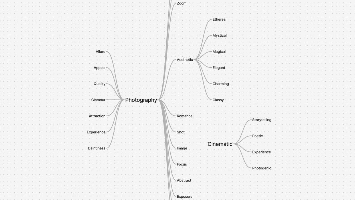
With this insight in hand, we began with mind mapping to explore potential brand names. This exploration then prompted some ideas for the logomark. We then built out mood boards capturing the essence of what would become the visual identity. We explored angelic, ethereal imagery as a potential jumping off point for the logomark.
We took these sketches and ideas, and then began developing logo concepts inspired by the pairing of a dove— showing angelic symbolism, and a sun— symbolizing new beginnings. Once the creative direction was chosen, we fully fleshed out this brand identity. We expanded into typography choices, color palettes and other assets.


