The Impact
The Kickstart Chocolate identity demonstrates how strategic branding can carve space in a saturated market. By combining energy-drink cues with premium dark chocolate aesthetics, the system conveys vitality, strength, and indulgence in one package. Though entirely fictitious, the identity highlights the potential of design thinking to shape consumer perception and position a brand against real competitors.
Kickstart
A conceptual identity for Kickstart Chocolate, a fictitious Brooklyn-based high-caffeine chocolate brand. Designed to merge indulgence with energy, the system balances bold flavor with a clean, modern aesthetic.
Service
Year
2025
Company
Conceptual Brand Identity
Industry
The Challenge
The brief was to create a new chocolate brand identity from scratch, with a clear theme of energy. Unlike traditional confections, this product needed to stand apart as a functional, caffeinated alternative while still delivering the richness and appeal of dark chocolate. The challenge was to merge a high-energy aesthetic with the sophistication of a premium food product, ensuring it could compete with brands like AWAKE Caffeinated Chocolate.
The Solution
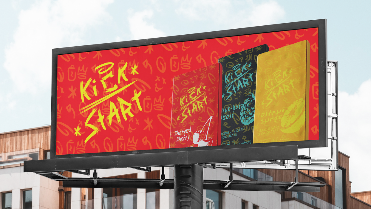
We developed a complete conceptual identity system that included: A bold wordmark and supporting marks built to express movement and energy; A dynamic mix of rich browns and energetic accents, symbolizing indulgence and vitality; a custom built typeface that represents the motion and energy that Kickstart envokes; A packaging system that includes distinctive wrappers for three flavors (Cherry Dark, Orange Dark, Raspberry Dark), each pairing the base brand with flavor-specific energy cues; Custom branded graphics reinforcing the high-caffeine positioning and modern Brooklyn aesthetic. The outcome was a cohesive visual identity that felt both indulgent and functional — a “kick” of energy captured in design form.
The Approach
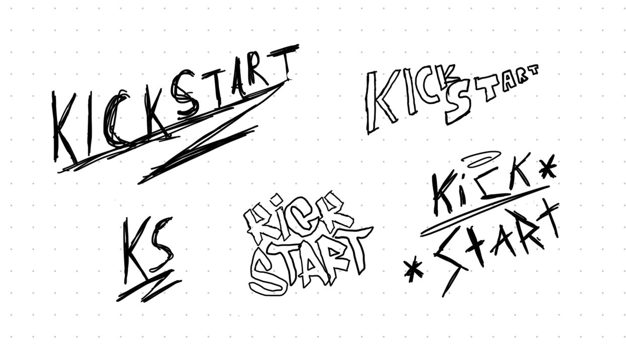
The project began with research into both the chocolate and energy drink markets, identifying gaps where the brand could stand out. Competitive analysis against AWAKE highlighted opportunities in calorie count, caffeine strength, and added benefits like Vitamin C and collagen. From there, we built mood boards around themes of vitality, movement, and indulgence, guiding sketch explorations and digital compositions.
The chosen direction emphasized bold typography and energetic compositions paired with dark, rich visuals to nod to the 70% chocolate base. Flavor extensions were visualized through packaging mockups, supported by brand applications across trucks, shipping boxes, and promotional material. Each design touchpoint demonstrated how Kickstart could scale as a lifestyle brand while maintaining consistency and energy at its core.


